
byneuestudio
The idea was to turn the space into a unique, fun and daring place. That the fact of going to buy clothes, was a unique and creative experience.
My store proposal was based on two different, very personal ideas, with the intention of bringing together in a single space a series of elements and sensations for an entire sector of customers only.
The project began with two very vintage styles, but inevitably although that retro essence has not been lost, the project has evolved around the phrase “I’m not a fashion slave”, a phrase that makes you think, am I? ? Or right? The decision is obviously up to each one, but the intention is to create emotions, an internal discussion and meet our thoughts, make the environment surround you and take you on a journey where you force yourself to be reborn, to rediscover yourself.
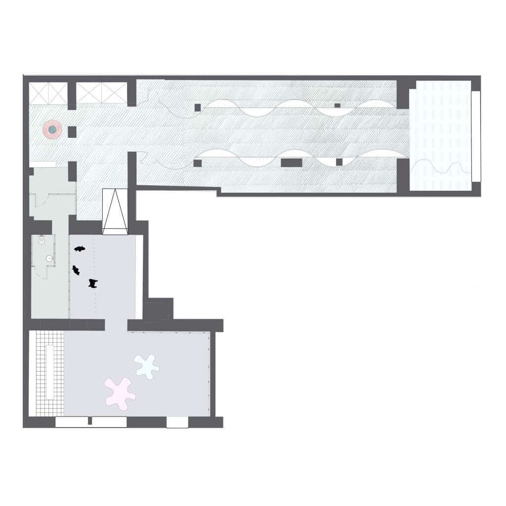
The store has different entrances and exits, but still there is a very marked route. Wherever you enter the middle point of the store is where you find the slogan, imprisoned with LED light tubes and in the background a mirror that covers the wall. The concept of the store always revolves around the users who enter, they are the ones who are incarcerated and when they leave, they will have a new vision of who they are and what they really want to be.
I have called it Cherry Blossom, because the shape of this flower is very reminiscent of the typical hippie flower of the 70’s, but with a completely renewed vision and meaning. This flower in Japan is the one found in cherry trees. In the fields where these trees are found, solemn receptions are held, known as Hanami, they are generally excursions where people come together to reflect on the ephemeral nature of life and mortality, due to the lifespan of flowers cherry tree is short. If we look at the store, it is like a channel through which we can observe and think about our lives, which, like the flower, is short, and it is the user himself who decides how to live, and see if he is another slave. system or not.
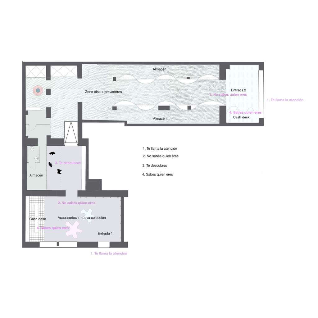
The information that you will see in the first image is the route that a user takes inside the store, entering through one entrance or another, it is designed so that the naked ones of the route are at the same points on both roads.
1. It catches my attention
2. I don’t know who I am
3. You discover yourself
4. You know who you are
MATERIALS: * in case the space / design was never done
_LED panels: used to create dynamism with the images and bring this retro, positive atmosphere closer, due to the different coverings – ceiling, walls and floor.
_Neon tubes: used as main elements – making use of the metaphor, referring to the bars that imprison us.
_Furniture: made with Krion (Porcelanosa) material. This material allows to create impossible shapes, to the taste of the consumer. It has the facility of being able to incorporate lighting inside — wave entrance no. two-.
_Lighting: lights from the Artemide group, by the central ola cabinet (magnetic vector) and by the passage areas (Castore pendant lamp).
Author: Carla Rovira.
Website: Byneuestudio
Location: Manresa, Spain.
University: ESDAP Catalunya.
Year: 2018